Fonts, Threads, and Legacy
Thursday, July 31, 2025
Some brands slap logos on hats. We don’t. We stitch stories.
When we started Fieldhouse Legacy, we didn’t just want to put your school’s name on a hat—we wanted to build a product that felt like the place. The memories. The meaning. The specific kind of loyalty that doesn’t always scream, but never goes away.
And that begins with design.
1. Starting with Ourselves
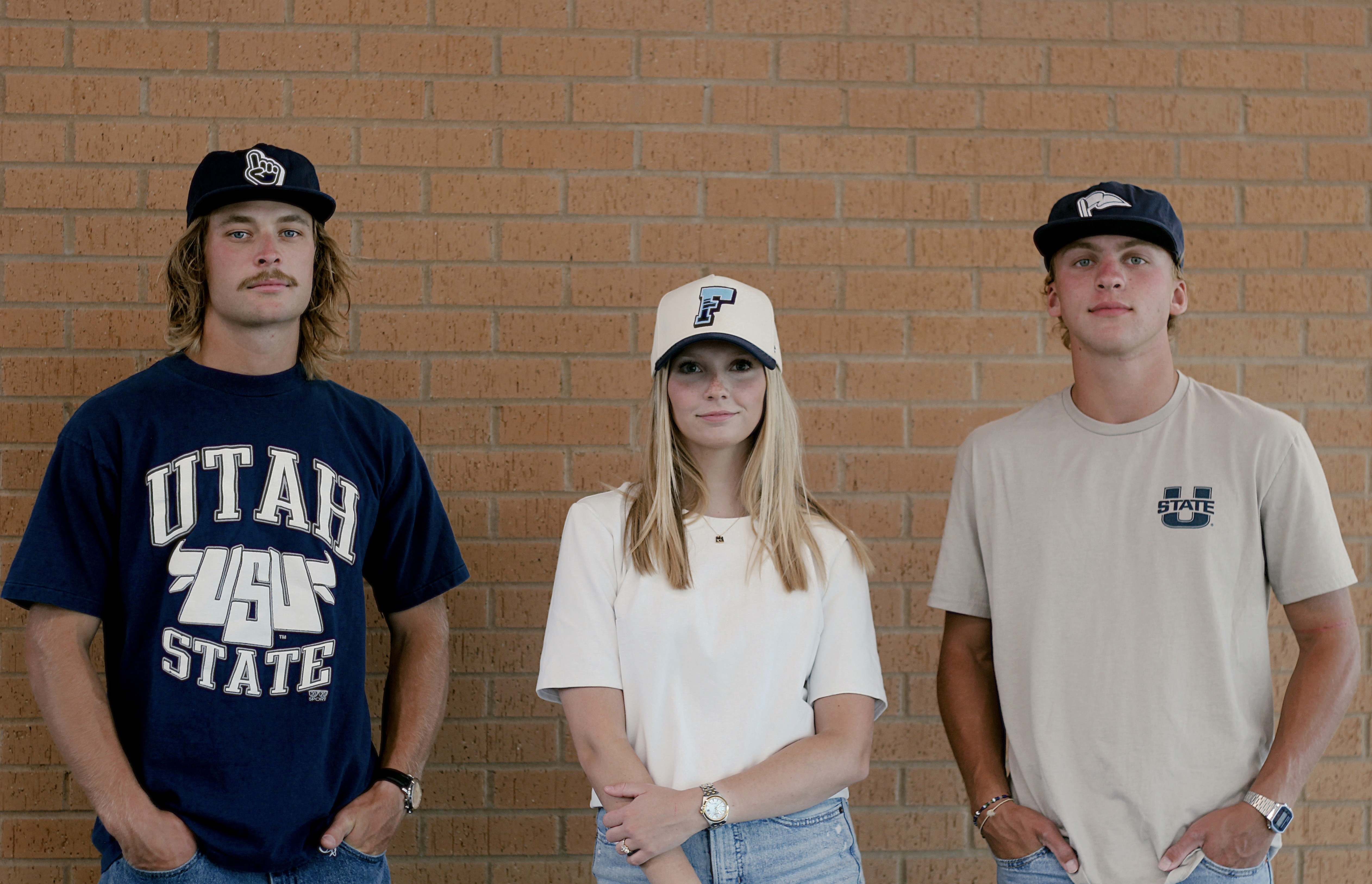
When deciding who we wanted to be perceived as we needed to take into consideration what we stood for, what we hoped our legacy would become, and also how we could connect to more than those who attended our alma mater. Because every business has a story, even before beginning the process of starting. For us, it was visiting campus stores across the state and seeing too many hats that only have the school logo or some version of the school's name typed out in a generic template approved by most schools across America. As guys that love to wear hats, especially ones that represent us, we had to find a different solution to the problem of being generic. Because of this, Fieldhouse Limited was born and hats that speak to you and school spirit.
2. Curating School Spirit
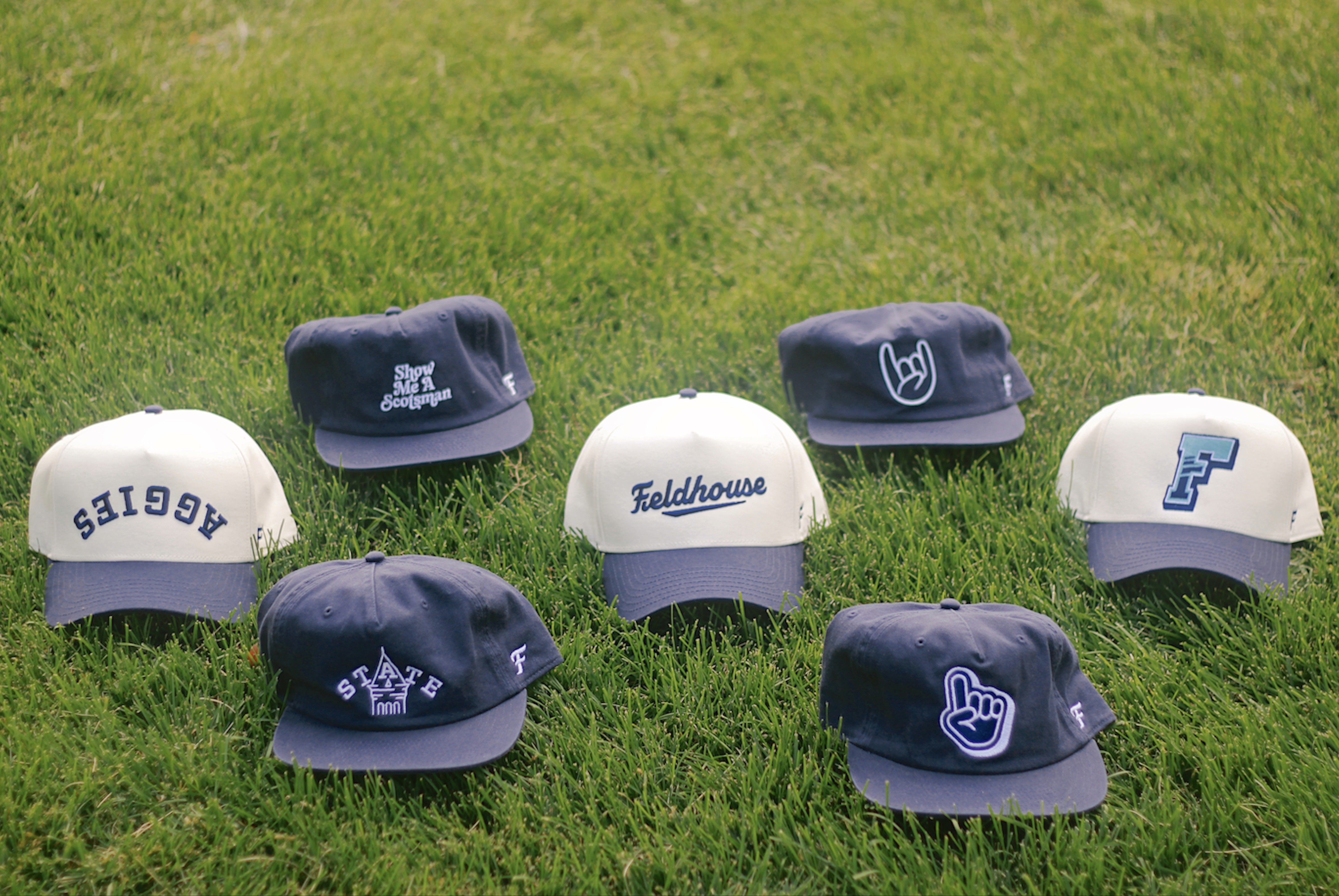
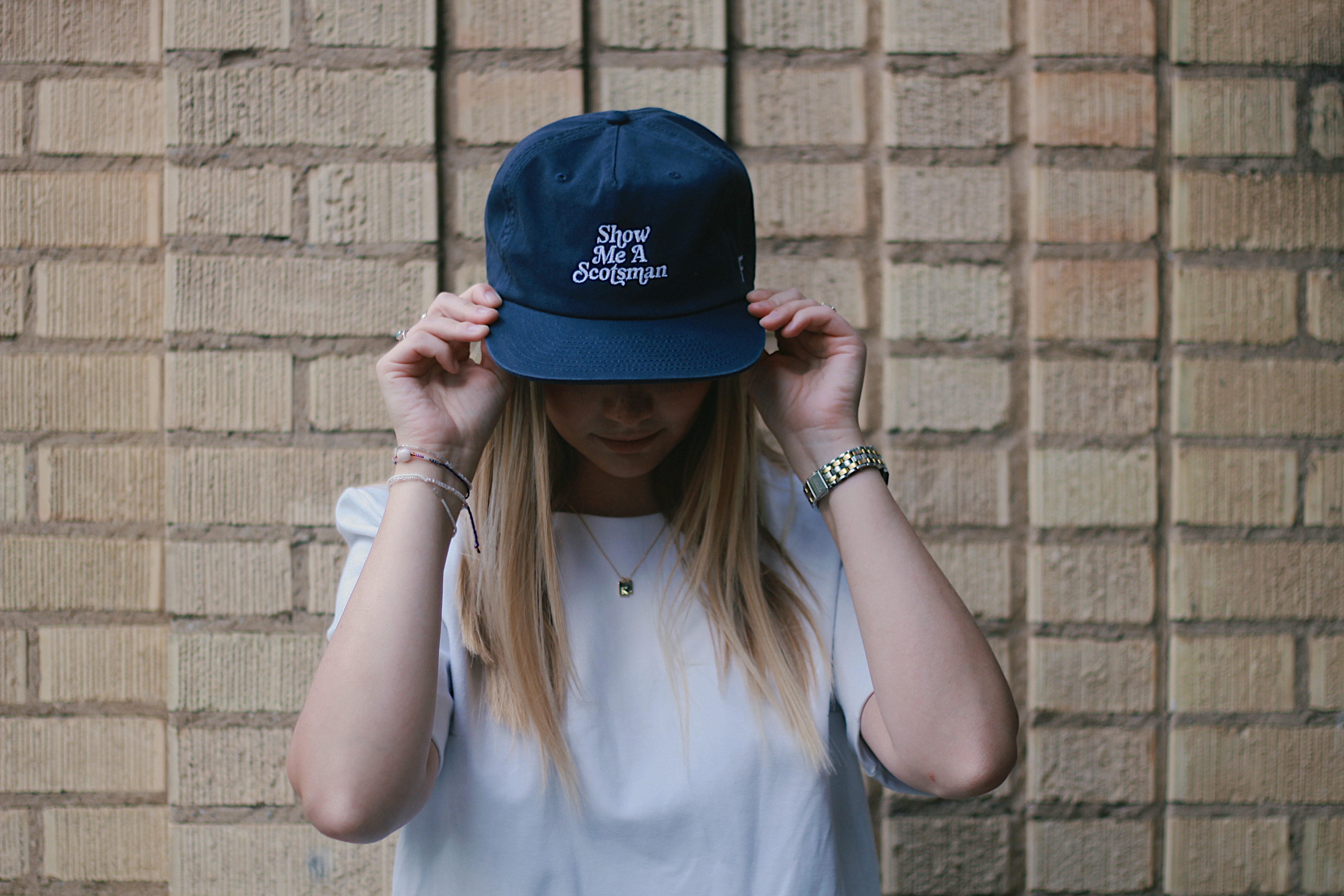
We spend just as much time choosing the right typeface as we do researching the school, students, events, teams, and school history. Because in our world, a design for our hats aren't just shapes—they’re a feeling, a reminder, a visual representation of membership. That slightly rounded varsity slab you see on The Scotsman? It’s modeled after lettering found in 1970s yearbooks. But we softened it, gave it room to breathe. Because it’s not just about nostalgia of the tradition—it’s about how memory lives within you.
On the Old Main - STATE cap, we used a stitched script inspired by old collegiate jackets. Not just that but we wanted to include arguably the most recognizable symbol in all of Utah State history, Old Main. We did this because Fieldhouse Limited isn't just for fanatics, it's for students and alumni alike. These pieces of your school's history are now apart of your history. So be proud of it.
A Final Thought
Everything we make is overthought on purpose. The curves, the negative space, the tilt of a serif—it’s all tuned to memory. To recognition. You don’t need to be a designer to feel it. It just clicks.
Because we’re not chasing trends.
We’re tracing legacies—with fonts and threads as our tools.
Best,
The Fieldhouse Team